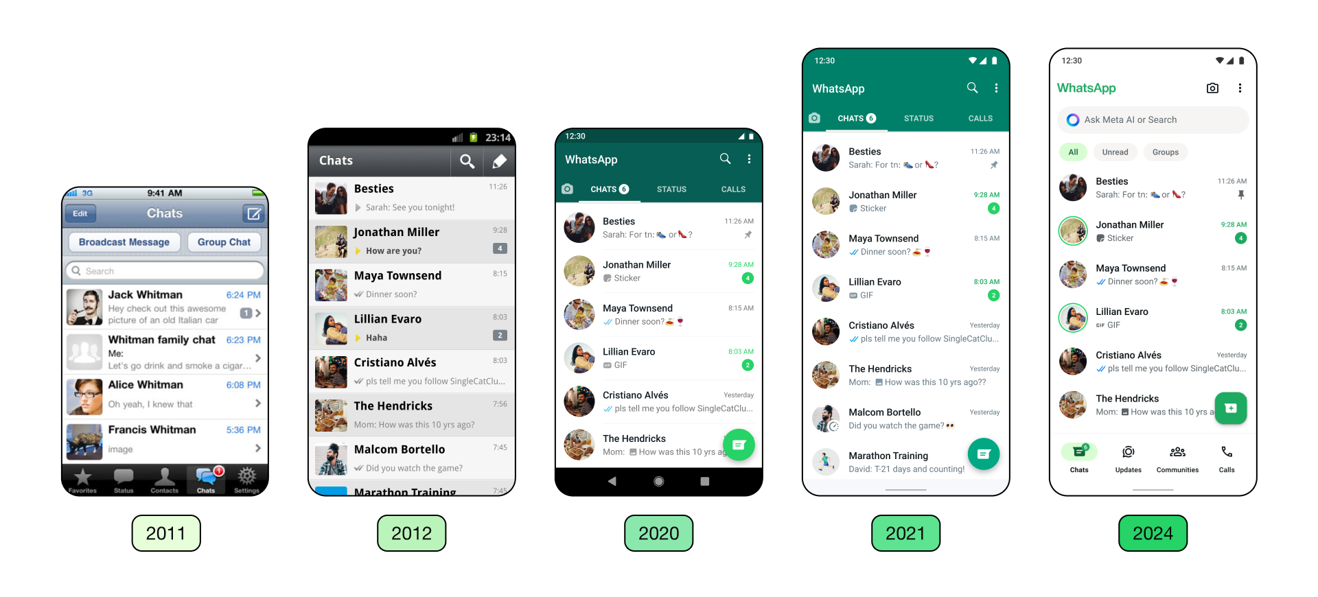
WhatsApp Starts Rolling Out New Design for iOS and Android Users
WhatsApp, the world’s most popular messaging app, has been rolling out a series of design changes to its mobile app interface on both Android and iOS platforms. While some of these changes are subtle, others are more noticeable, aiming to enhance the app’s overall user experience.
One of the most significant updates is the introduction of chat filters. These filters help users navigate more efficiently by providing separate tabs for unread messages and groups, making it easier to stay organized and prioritize important conversations.
In addition to the chat filters, WhatsApp has made a conscious effort to align the iOS and Android layouts, creating a more consistent experience across platforms. This move streamlines the app’s interface, making it more intuitive for users who switch between different devices.
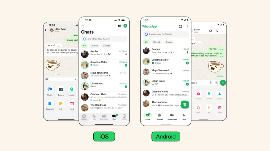
“When designing, we consider varying levels of connectivity and digital literacy to keep WhatsApp accessible, and we’re careful with changes that affect people’s muscle memory. This helps us be more intentional about the problems we solve for and minimize product disruption,” the company wrote in a blog post.
Color Palette and Dark Mode Enhancements
One of the most visually striking changes is the new, consistent green color palette. WhatsApp’s designers carefully considered over 35 different options before settling on the refreshed hue, which now permeates the app’s interface.
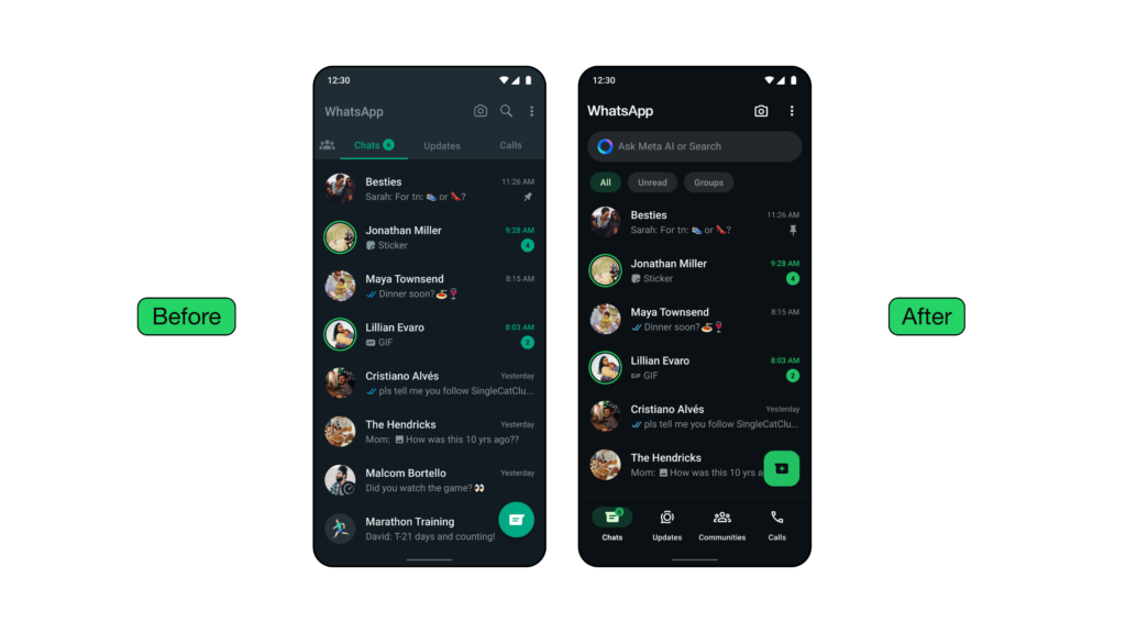
For Android users, the update also brings an enhanced dark mode. This mode uses higher contrast and deeper tones, reducing eye strain and improving legibility in low-light conditions. This feature is particularly useful for those who prefer a more comfortable viewing experience, especially in dimly lit environments.
Redesigned Icons and Animations
In addition to the color palette changes, WhatsApp has also updated its icons with a rounded, outlined look. These new icons are accompanied by redesigned illustrations and fresh animations, creating a more modern and visually appealing interface.Even the default doodle background has received a subtle refresh, adding to the overall polished look and feel of the app.
Bottom Navigation and Attachment Tray
The design overhaul also includes the bottom navigation bar for Android users, introduced in March 2022. This feature provides a more intuitive way to navigate between different sections of the app.
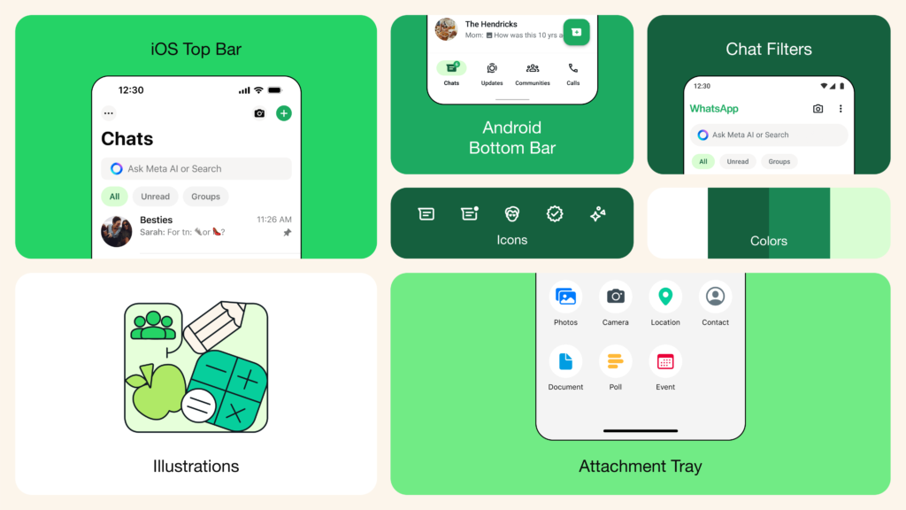
Meanwhile, iOS users can enjoy a new attachment layout with an expandable tray, replacing the previous full-screen menu. This change streamlines the process of sharing files and media, making it more efficient and user-friendly.
With these design updates, WhatsApp continues to refine its user experience, ensuring that its app remains accessible, visually appealing, and easy to navigate for its billions of users worldwide.


